jump to...
Day to Day Accessibility Tips and Tricks
Wait, what? You are telling me I should explain why I have that arrow shape in the slide? This is where my accessibility awareness journey started pretty much around a year ago when I built my first trainer deck for one of the Microsoft Cloud Workshops. Like many of you, I have maybe built thousands of decks but with no clue about accessibility. Back in that day, I was working for Solliance building a Microsoft Cloud Workshop, and Microsoft had a throughout auditing process and detailed guidelines about accessibility.
Last week, as a new employee, I went through Microsoft’s internal employee learning portal and found the Accessibility 101 online course. To my surprise, the course did have a good amount of practical information and connected the concept of accessibility nicely to inclusion and diversity. In this post, I want to share a couple of the practical steps to help you step up your accessibility game. If you are where I was, I’m sure you will love these.
Color Contrast Analyzer
Have you ever been in a situation where you felt like, “why would you write light blue on a white background!” :) Don’t even get me started with the fact that your audience can include individuals with vision disabilities like color-blindness and low-vision impairments. Now you can go to the TPGi web site and download the Colour Contrast Analyser (CCA).
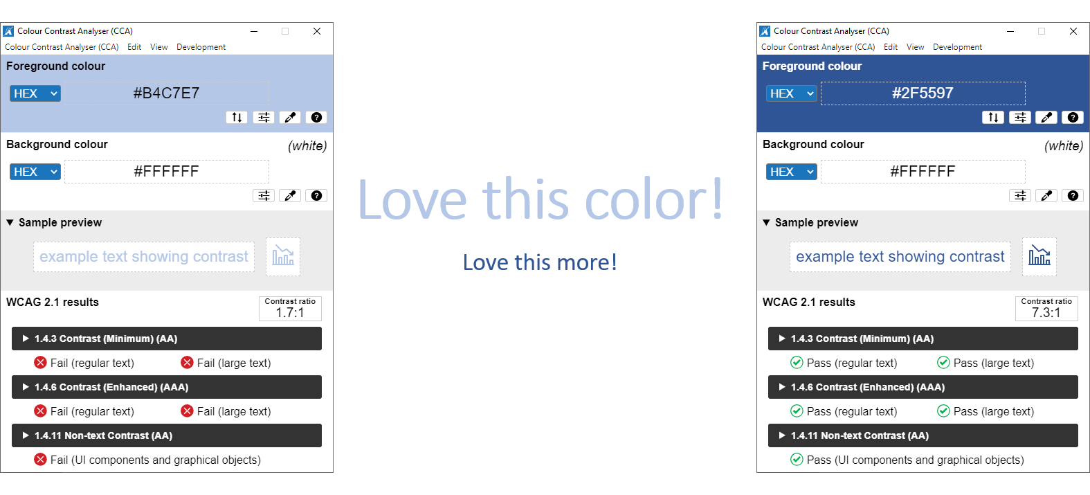
Above, you can see two different shades of blue. I bet most of you, including me, would feel comfortable using both colors in a presentation. However, the light blue fails the test. It might be relatively easy to assess contrast against a white background, but the analyzer can be a much safer bet in complex scenes.
Accessibility Checker in Powerpoint
Another trick that can help to build more accessible presentations is to make sure alt texts are set, objects are adequately grouped, and slide titles are available. Using the built-in Accessibility Checker in Powerpoint is amazingly helpful on this front.
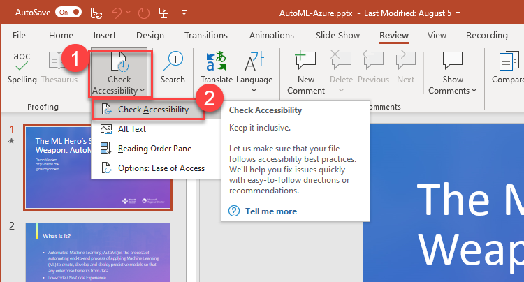
At first look, it might feel overwhelming to set alt text for 43 objects :) In my case, most of the time, the numbers are high because I did not care to logically group objects in a meaningful way. For example, it does not make sense to set alt texts for each parameter image in the screenshot below. Once I group them into a single object, that’s when it makes sense to explain what the visual represents.
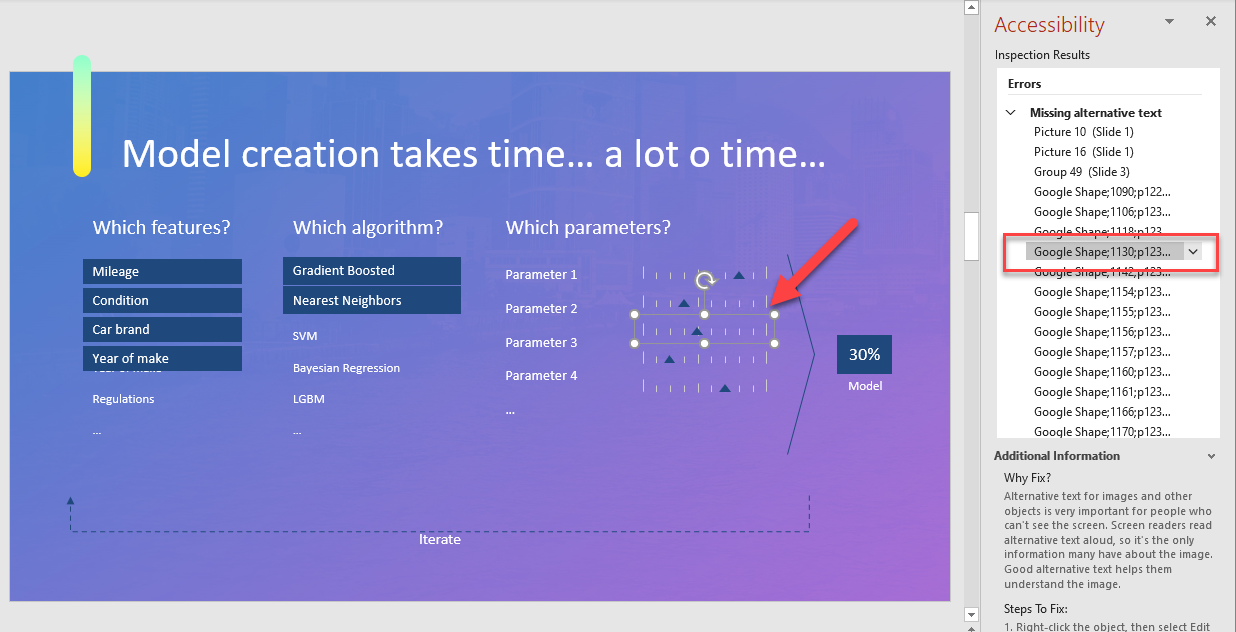
Trust me; once you get used to it, it does not take more than an additional 3-5 minutes to write things down. The extra effort you put in helps a lot in crafting a more inclusive and accessible presentation, unless you present in Teams by sharing your desktop! That kills all the accessibility features as the entire content streamed is considered a video feed of your desktop. Please, use the native slide-sharing functionality your favorite collaboration, and presentation tool provides to give it a chance to expose accessibility features.
Live Captioning
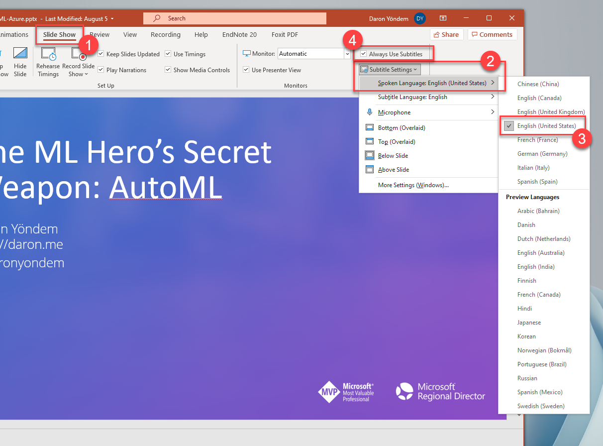
Captioning is another vital accessibility feature when it comes to presentations. You can enable live captioning for free in Powerpoint. Just go to the Slide Show (1) tab and select the Spoken Language, Subtitle Language (2), and finally, check Always Use Subtitles (4). The next time you start presenting, you will see live captions. That’s all!
Accessibility Insights for Web Content
Obviously, creating accessible content and applications is a vast topic to be covered here, but there is one additional piece I want to mention. That’s about creating accessible content on our blogs and increasing the accessibility of the overall web content we generate. That’s where you can go and add the Accessibility Insights for Web plug-in to your browser. The plug-in has a Fast Pass that checks around 50 different accessibility requirements, and a full assessment option checking compliance with Web Content Accessibility Guidelines (WCAG) 2.1 Level AA.
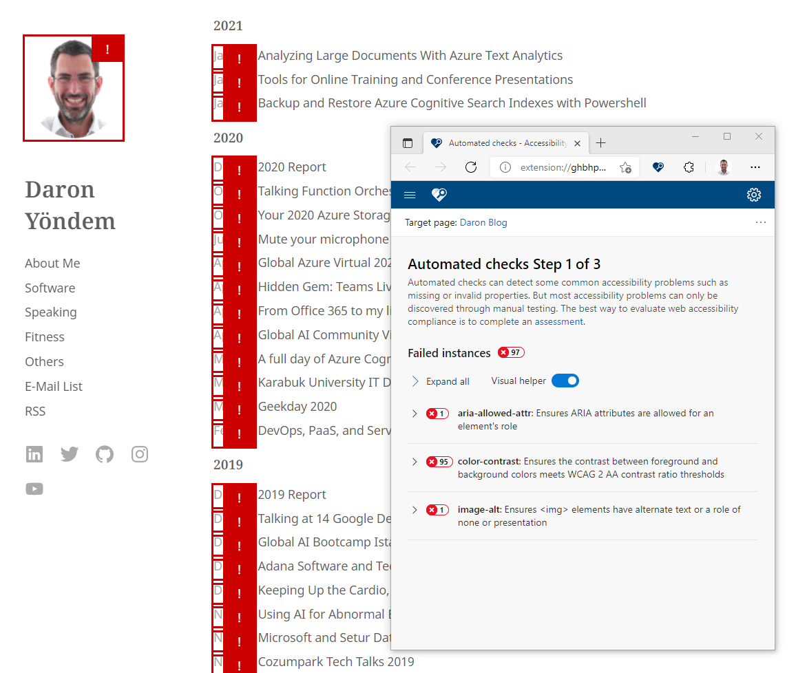
You can use the tool to fine-tune your blog -apparently, that’s what I have to do- or you can use it for any web content you generate to see how you are doing on the accessibility front.
When it comes to accessibility and inclusion, everything counts, and there is always more that can be done. If you have your own tricks, please write, share and promote awareness for a more inclusive world to live together. See you in the next post!
Resources
Daron Yondem advises senior technology leaders on AI-driven organizational transformation. Learn more →